Pick your color:
Division Widgetised

DivisionWP supports widgetized areas all around the template. Use this areas or disable them. Insert any widget in up to four columned areas.

Live Feed
Get In Touch!
Team MemberFebruary 16, 2014

Check out the responsive behaviour of The Division template

Animated responsive header

Keytar single-origin coffee polaroid trust fund gastropub stumptown. Church-key Schlitz Pinterest typewriter cliche iPhone cray. Paleo Austin pug.

Tested on all devices

Brunch messenger bag ugh mixtape Intelligentsia, Bushwick VHS wolf. Pitchfork try-hard authentic hoodie, organic Banksy sustainable literally mustache.

Responsive items

Bitters single-origin coffee tousled, gentrify before they sold out iPhone pickled Williamsburg butcher McSweeney's kogi deep v disrupt Truffaut.

Looks good on all screens

Lorem ipsum dolor sit amet, consectetur adipisicing elit, sed do eiusmod tempor incididunt ut labore et dolore magna aliqua.

Retina display ready

Lorem ipsum dolor sit amet, consectetur adipisicing elit, sed do eiusmod tempor incididunt ut labore et dolore magna aliqua.

Perfect content placement

Lorem ipsum dolor sit amet, consectetur adipisicing elit, sed do eiusmod tempor incididunt ut labore et dolore magna aliqua.

Visually appealing

Lorem ipsum dolor sit amet, consectetur adipisicing elit, sed do eiusmod tempor incididunt ut labore et dolore magna aliqua.

Every single page was analyzed with the use of iPad, tablets & mobile devices

We made sure that every page is visible regardless of the operating system or the device manufacturer. We tried to cover all major devices on the market

We made sure that all elements & shortcodes look good in responsive UI

We designed and developed shortcodes with responsive design in mind. All elements look good and are functional regardless of the viewing resolution

Mobile responsive system

The Division is prepared for all major mobile displays while taking advantage of their screen displays and resolutions
Perfectly aranged content

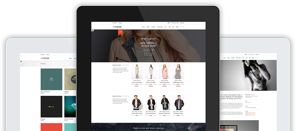
The content that is displayed on mobile devices is displayed perfectly both for browsing and reading. We payed special attention to the font line heights and titles.

Responsive logo version

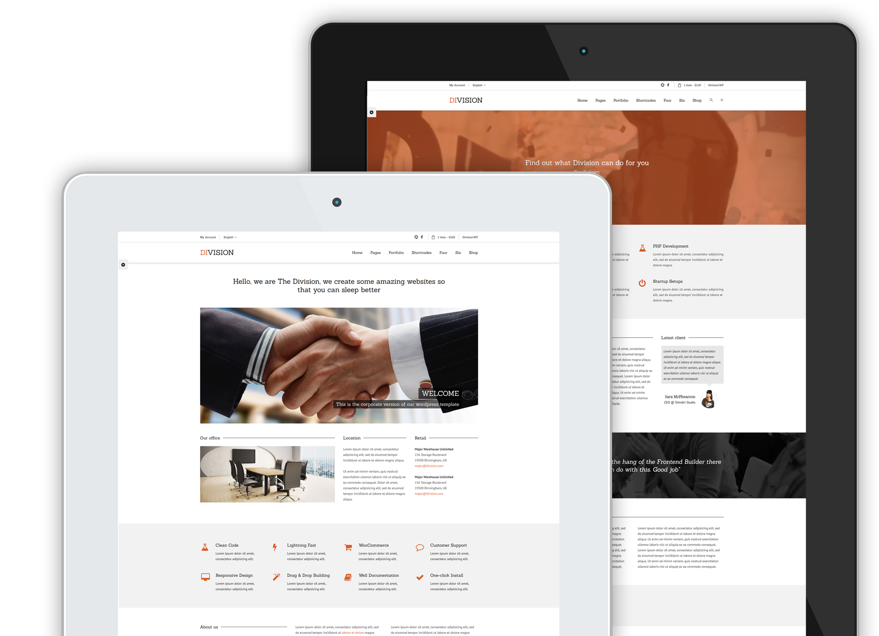
The logo is displayed next to the menu and widgets icons and it can be changed or re-arranged along with other header elements. It fits perfectly on all 3 versions.

Hover or ''double tap'' option

Hovers in mobile versions are preserved since the single tap on the screen of iPhone devices displays the hover state. On other devices both taps do the same thing.

Both portrait & landscape

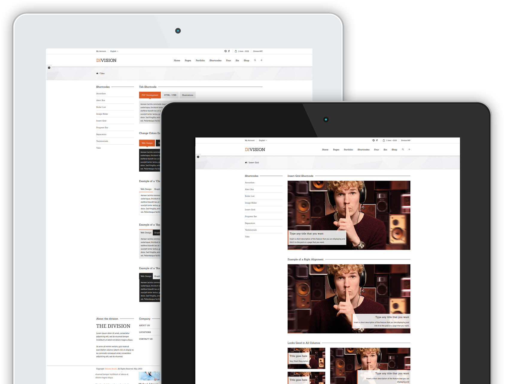
The Division performs excellent on both portrait versions and landscape versions. The switch is lightning fast as is the entire website.

Functional mobile menu

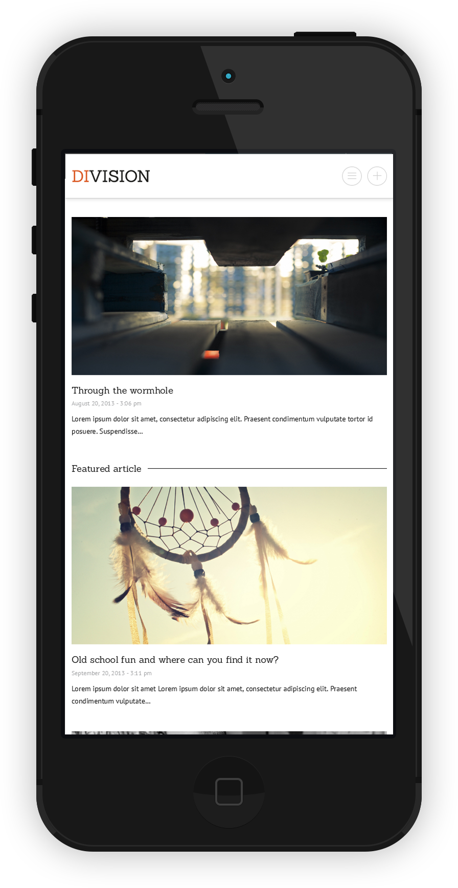
Carefully designed mobile menu with perfect dimensions for a regular tap on the flat screen. Animated extension of the main menu and sub-menu items.

Top widgetized area on a click

Widgetized area that is activated when you clock on a "plus" icon is also present on the mobile menu and it also includes cart, language and other items that you have.

''Mega menu'' with all the perks

Every item, widget or a post that you might have in the regular menu is also present in the mobile responsive version. You will not lose a thing.

Touch and slide friendly menu

Mobile menu uses all advantages of modern mobile navigation to make the browsing experience as pleasant as possible for you and your visitors.

Users on desktop
Users on tablets
Users on phones
Users on other devices

Are you conviced or you need more convincing?